JUGENDSTIL* CHEZ TROCKEL: AN ARTIST DESIGNS CARPETS
By Lisa Zeiger
“*Jugendstil: another name for Art Nouveau...from Jugend literally: youth, name of illustrated periodical that first appeared in 1896, + Stil style.”
—Collins English Dictionary
“A house is not a machine to live in. It is the shell of man, his extension, his release, his spiritual emanation.”
—Eileen Gray
When Rosemarie Trockel makes art, she is an artist. But when she designs objects for everyday life--furniture, carpets, vases, and, most significantly, her own Cologne interior, she is an unadulterated designer. (I remember particularly a veneered wooden bed and a beautiful soft blue carpet with multicolored fringed ends--designed by Trockel for her bedroom.) Both these tributaries of creation flow from her lucid stream of sense and sensibility.
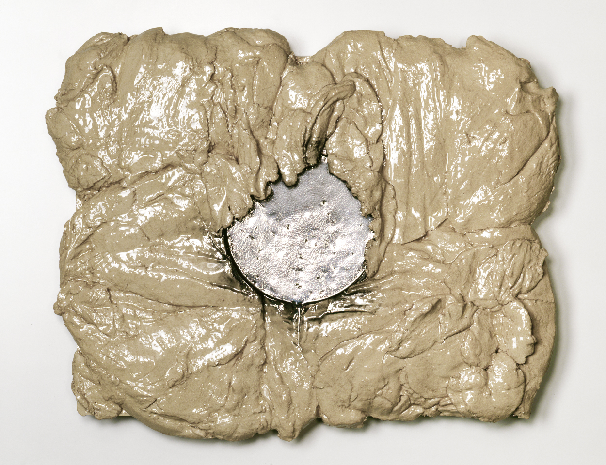
If Trockel’s sensibility is unique, idiosyncratic, and highly aestheticized, her sense is stubbornly common. In her design work, she exerts horse sense, creating useful objects that answer practical needs with heuristic insistence; their beauty incidental rather than pursued. Happily, Trockel is temperamentally incapable of ugliness, except for occasional deliberate excursions into the jolie-laide, as in her recent ceramics, their lumps and excrescences totems to chaos and abjection. As a designer, in contrast, her furnishings insinuate visual allure, albeit subjugated by the functional priorities of Trockel’s inner housewife.
ROSEMARIE TROCKEL, LESS SAUVAGE THAN OTHERS (2007). CERAMIC, PLATINUM GLAZED. Copyright Rosemarie Trockel and ARS, 2019.. Courtesy Sprüth Magers.
It was Trockel’s elevation of "hot plates" into minimalist icons--dark electric stove burners placed onto colorful backgrounds--that galvanized her fame in the mid-1980s. These banal appliances of lower middle-class kitchens, heretofore invisible because of their ubiquity, pilloried the sheer ugliness of unpaid female drudgery. Beginning in 1985, her geometric knitted and machine-produced textiles--wall panels, balaclavas and other clothing--made still broader political statements through well-known woven-in logos, from the Playboy Bunny to hammers and sickles, and swastikas. The individual expression possible within the art of weaving--the most archaic form of women’s work apart from prostitution--was stolen by stamps of male corporate approval.
ROSEMARIE TROCKEL, MA FENETRE, 2005. 2 HOTPLATES, (IRON, STEEL, WOOD). Copyright Rosemarie Trockel and ARS, 2019.. Courtesy Sprüth Magers..
As a designer, Trockel no longer toys with such stigmata. Instead, she enhances the hidden life of dwellings as our last remaining freedom, arguably the only domain of individuality left to us in cities enchained by chain stores. Within the walls of a house, utility may unleash art: weaving, building, painting, cooking. Trockel takes up her axe, no longer to grind, but to build: constructing, as play rather than chore, objects that serve our needs and please our wants.
Trockel’s carpets, produced at intervals from 1991 through the present, represent her most concentrated, unified, and useful effort at serial decorative design. Their timeline traces an evolution as logical as it is mysterious, a progression from critique to creation for its own sake, always, however, with deference to function.
In 1991, Trockel designed two seminal carpets, “Woolmark” and “Plus Minus,” still hand-woven today in Nepal for Equator Production, the latter founded in 1985 in Brussels by Petra Singh and her late husband, Ranbir Singh, and still led by Petra today in New York City, with new designs by an outstanding array of major contemporary artists. The couple’s original programme for Equator included Trockel, Felix Gonzalez-Torres, Joseph Kosuth, Guillaume Bijl, Walter Dahn, Georg Dokoupil, Rob Scholte, and Albert Oehlen. Since reinventing Equator in 2017, Petra Singh is ever more ambitiously producing carpets by artists such as Alan Belcher, Joseph Kosuth, Julião Sarmento, Heimo Zobernig, Liam Gillick, Emilia and Ilya Kabakov, Jonathan Monk, Emilio Prini, and Ken Lum. Singh’s roster of artists reflects her conviction that carpets are icons of high art, woven equals of works on canvas. Their domestic function is seen as subservient to their artistic aura; utilitarian though they may be, they are inseparable from the artist’s total oeuvre. Both carpet and canvas are ruled by the artist’s eye.
The rich carnelian red background of “Woolmark” is embellished with serried ranks, in beige, of the Woolmark Company’s enduring logo, introduced by the company in 1964. Designed by Italian graphic artist Francesco Saroglia (an alias used by the Italian architect, graphic designer and artist Franco Grignani), the history of the Woolmark logo has more to do with art than commerce. (It is worth noting the minority view, or rumor, which attributes the Woolmark logo to artist Bridget Riley, who worked as an art director until 1962 at the advertising firm, J. Walter Thompson.)
ROSEMARIE TROCKEL, “WOOLMARK CARPET” (1991). Photograph courtesy of Petra Singh/Equator Production.
A one-time Futurist who would exhibit alongside Jasper Johns, Francis Bacon, and Anthony Caro at Documenta 3 in 1964, Grignani, not unlike Trockel, led a double life as both fine artist and graphic designer, engaging each calling with lyric intensity. His approach to inventing a logo defied the blandness of corporate values: "The drawing of a logo for a designer is the most […] exciting assignment, because in that symbol he tries to pour all his graphic sensitivity.” His other pronouncements border on manifesto: “...graphic art must rely on a large number of experiments in order to achieve perfect freedom, facing the routine daily activities.”
Trockel’s adoption (I loathe the fashionable word “appropriation”) of the Woolmark logo for her first carpet and in other woven artworks was not a feminist scourge but an artist’s tribute to Grignani’s ingenious trope. Its half-century as possibly the most famous logo in the world transcends — and perhaps transgresses--the corporate agenda that commissioned and used it for commercial profit.
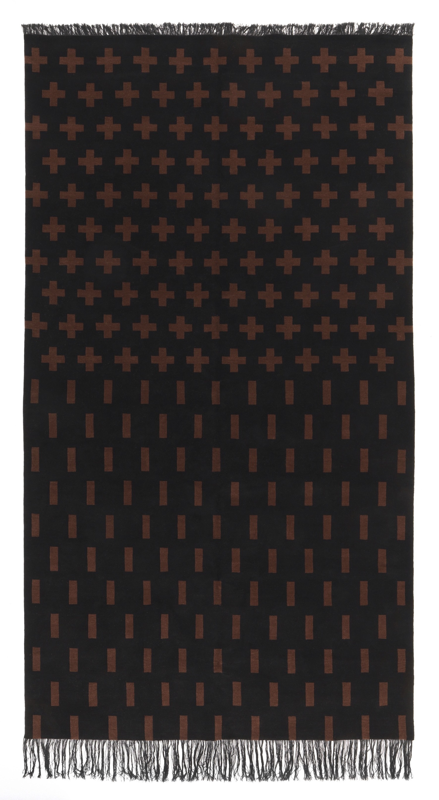
ROSEMARIE TROCKEL “PLUS-MINUS CARPET” (1991) Photograph courtesy of Petra Singh/Equator Production.
A second Trockel carpet from 1991 is her “Plus Minus.” Like “Woolmark,” it is composed of symbols in regimented rows upon a solid background, in this case black. The carpet’s upper half consists of ten rows of brown “plus” signs, in alternating lines of eleven and ten. The lower half is composed of eleven rows of “minus” signs oriented vertically rather than horizontally, thereby changing them from mathematical symbols into a lively but meaningless abstract pattern.
The ciphers of “plus” and “minus” signify an infinity of meanings, some official, others read into them by art critics of various ideologies. Just as the triple intertwine of the Woolmark logo, without beginning or end, recalls the lemniscate--the mathematical figure for infinity resembling a figure eight--so the “plus” and “minus” signs invoke an eternity of opposites: gain and loss; yin and yang; dark and light; and, of course, male and female, to name just four binaries they suggest or outright denote.
As in all of Trockel’s oeuvre, in which art critics so habitually find socio-political critique, I see something else: I see play, pattern, order, and duplicity, all engaged in by the artist to provide pleasure rather than score political points. As art history marches on, whatever extra-artistic message Trockel’s work signifies to present-day academic cadres will coil in on itself and disappear, leaving in its wake that which matters and endures: the visually compelling, seductive forms she thinks in and makes real through the work of her own hands or, in the case of carpets, the craftsmanship of others.
This brings me to Rosemarie Trockel’s most recent carpet, entitled “Jaune/Jeune.” Its plain expanse is empty of symbol; traversed instead by a spacious grid of skinny orange-red lines and a tightly woven border of the same color. Unlike her earlier carpets, it bears no marks of meaning, and thereby averts elaborate misinterpretations. “Jaune/Jeune” pretends to nothing more than household use. Unlike “Woolmark” or “Plus Minus,” “Jaune/Jeune” would look vacuous hanging on a wall.
One of Trockel’s wittiest design solutions, “Jaune/Jeune” expresses function through a trick of texture. The thin red line divides the carpet into two halves, each distinctively woven to demarcate and facilitate two different domestic uses of floor space. One half of “Jaune/Jeune” is fabricated in abundant shag, to soften a hard floor for sitting or reclining in comfort. The other half, its flat, tight weave resembling that of sisal matting, is designed as a durable platform for furniture. Shag is a plus; matting, a minus.
ROSEMARIE TROCKEL, “JAUNE/JEUNE” CARPET, ( 2018). Photograph courtesy of Petra Singh, Equator Production.
Finally, “Jaune/Jeune,” Trockel’s title. Always fond of wordplay, Trockel has now confined symbol to two French adjectives split by a slash, rather than inscribing its emblems across a large surface in repetitive formation.
The meaning of “Jeune” has, with a certain melancholy, always haunted Trockel’s repertoire; a nostalgia for youth long before its loss. As a young artist, Trockel was an old soul, conscious of the futility of human attachment, affixed so often to precisely those people, places and things which lack staying power. Unlike me, even in her own youth she was able to regard youth and beauty from a safe remove; choosing wisely to capture forever its possessors in photographs instead of the fleeting press of their flesh.
ROSEMARIE TROCKEL, DEMANDING PERSON BUT A SUBLIME POET, 2016. DIGITAL PRINT ON PAPER.
Copyright Rosemarie Trockel and ARS, 2019.. Courtesy Sprüth Magers
ROSEMARIE TROCKEL, YES WHERE OTHERS SAY NO, 2014, DIGITAL PRINT ON PAPER. Copyright Rosemarie Trockel and ARS, 2019. Courtesy Sprüth Magers.
As for her title’s other half, “Jaune,” the particular pale yellow Trockel so assiduously sought and specified to the Nepalese for her carpet is, like youth, a plus shadowed by a minus. Yellow’s very essence, its luminosity, renders it the color easiest to soil. Of yellow, Goethe had this to say:
“In its highest purity it always carries with it the nature of brightness, and has a serene, gay, softly exciting character...its utmost power is serene and noble, it is, on the other hand, extremely liable to contamination, and produces a very disagreeable effect if it is sullied, or in some degree tends to the minus side.”
I rest my case. Rosemarie Trockel upholds beauty, use, and order; backbone of design; heresy of contemporary art. With “Jaune/Jeune,” a design stripped of the coded patterns that made her famous, she continues to unlock the concealed ambiguities of binary symbols and their unadmitted, sometimes inadmissible meanings.
A coda: if Rosemarie Trockel’s art qua art exposes our open psychic and societal wounds, her domestic design serves to bind them up; bent as it is on harmony rather than disruption. In great design—by, for example, figures as diverse as Eileen Gray, Jean-Michel Frank, and Theo van Doesburg, to name a fraction of the canon—the ineffable eye of the artist governs tables, chairs, and rugs, soothing us within our surroundings, as surely as it informs the more ambivalent, provocative pleasures of what we hang on our walls.
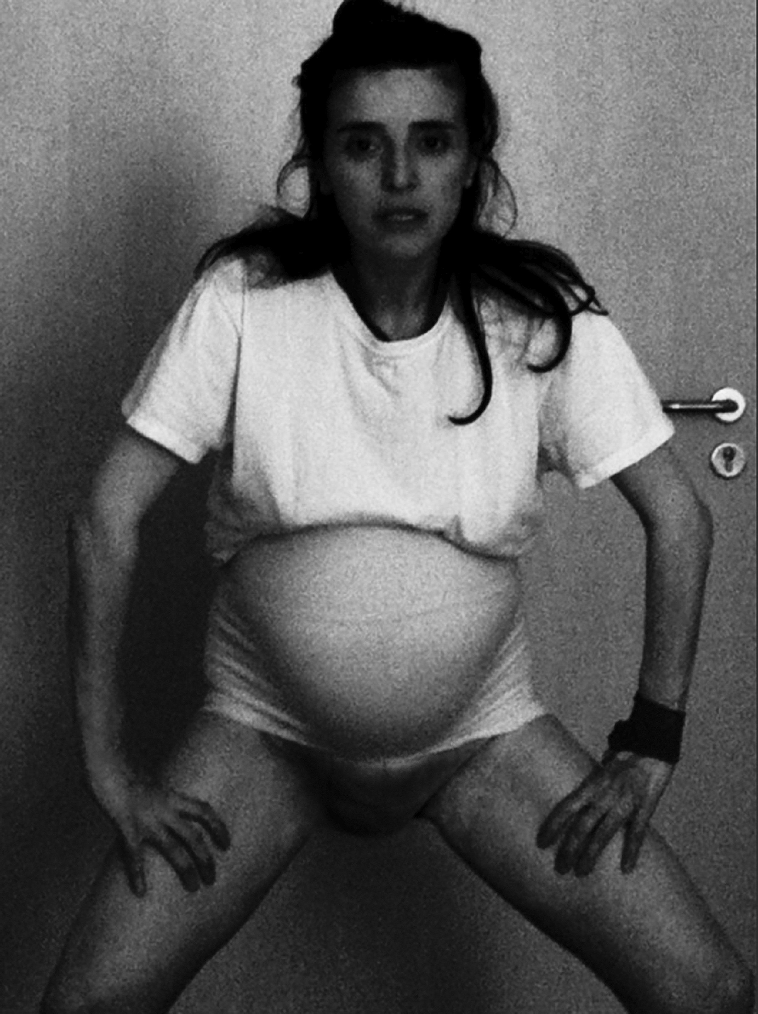
ROSEMARIE TROCKEL, REPLACE ME, 2009. BLACK AND WHITE DIGITAL PRINT, FRAMED. Copyright Rosemarie Trockel and ARS, 2019.. Courtesy Sprüth Magers


